🎉 Color Your World with Confidence!
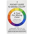
The Cox Pocket Guide to Mixing Color is a compact, 3" x 5" resource designed for artists and designers. Weighing just 0.0375 lbs, it features comprehensive color mixing guides, gray scales, and the ability to create personalized palettes, making it an essential tool for anyone looking to enhance their color knowledge and creativity.
L**L
Great reference card
Great reference guide at my fingertips.
A**R
Very informative and easy to use
The color guide is easy to use and helpful to harmonize colors.
D**E
Came in great time and works well
Great and handy guide
D**D
Pocket Guide to Mixing Color
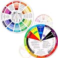
I was initially excited to receive this handy Pocket Guide which is intended to be a supplement to the color wheel. The information is printed on sturdy laminated card board with vibrant colors. I was sure that I was going to find this to be very handy until I actually compared the colors displayed to that of the color wheel & discovered that the Split Complimentary Colors listed were all incorrect. For example: Red Violet, Yellow, & Blue Violet; however, this is incorrect & should read Blue Violet, Yellow, & Green. I can most definitely read a color wheel. Both the complimentary colors & Triadic Harmony are correct. There is no chart for Tedtrad which is a combination of 4 colors. I am going to email them & point out this to see if they can improve upon this product because it has the potential to be an excellent product with some tweaking. I would not recommend this product at this time.Update: I did send an email to info@colorwheelco.com & they were kind enough to respond to my question. Their response was that the color wheel is correct. When reading the Split Complementary Chart, use the center color as the pure color. So you will look at the yellow in the center & see that the red violet & blue violet on either side are the complementary colors.
A**N
Love it
clear, easy, right
J**T
Perfection!
Perfect to take in a purse or pocket when shopping!
R**S
Great for makeup artist
I love this to keep in my pocket when having to mix makeup colors .
H**T
Useful for the right person
This is a fold out 12 page pamphlet (11 with information, 1 is cover). It is designed for people who have a problem understanding how a color wheel works. In illustrates actual primary colors, secondary colors, intermediate colors. Gray scale tones are also shown. Illustrates the difference between tints, tones, and shades. Illustrates the difference between warm and cool colors. Illustrates complementary, triadic and split complementary harmony combinations. And uses the same color wheel diagram to determine the difference between tetrad, triad, split complementary and complementary harmony diagrams. In my opinion, the person who would benefit the most from this purchase is someone who has a problem understanding how the harmony diagrams work.If you know how a color wheel works, you really don't need this. If a color wheel is a mystery and may always be a mystery to you, it might help you.
TrustPilot
vor 2 Monaten
vor 3 Tagen